Email Marketing 101: Building & Managing Your Mailing List
The money is in the list – that’s what you’ll hear most people say and they ain’t wrong. A lot of revenue can be generated if you build an awesome list of subscribers, however, you need to tend it with caution otherwise there’s a chance you might lose some of your followers. Basically, there’s two “difficult” tasks in the world of email marketing – building an email list and managing said email list.
Today we will introduce you to said world and then we will take an in-depth look at both of the aforementioned tasks. I will also show you exactly how this website generates leads and how we tend with caution to the emails that people have entrusted us with.
What You’ll Learn
- Introduction to email marketing – what it is, what it includes, what you need in order to do it efficiently, and pretty much everything else you need to know in order to gain a solid fundamental knowledge on the subject.
- How you can quickly and easily build your own email list from ground zero – I will show you the exact strategy we use to convert our website’s visitors into mailing list members. It’s very simple and we basically utilize just 2 WordPress plugins – Thrive Leads and BizPanda.
- Managing your mailing list – creating autoresponder email series the right way, creating efficient email templates, HTML vs plain text, the best performing email campaigns, writing an outstanding email copy, and everything else that involves the management of your email subscribers.
- Conclusion – bottom line is building your email list is…
Introduction to Email Marketing
Now, when it comes to email marketing, I’ve gone the extra 7 miles of research before I launched this website. To be honest, at the start, I didn’t know much about this specific type of marketing although I thought I did. Then I read a few posts on EM and I even bought a few specialized training packages that showed me how little I knew. All this got me on the “right” path towards the email marketing heaven. I surrounded the word “right” with quotes, because I think that there really is no one “right” way to do email marketing – every list is different and its owner must account for that in their strategy.
The Definition of Email Marketing
So what is email marketing? Basically, it’s the marketing of some product/service/information/post/article/etc to a group of people (your mailing list) via an email message – simple as that. However, not basically, it is the complex process of building a relationship with the people on your mailing list, providing them with information they want or need (yes there is a difference), with the end result being profits for your business.
But how do you actually profit from a mailing list? Well, this one is very easy too – the email messages you send out to your email subscribers can contain:
- Links of your products/services.
- Someone else’s products/services.
- Affiliate links.
- A link to a post where you promote some products/services.
- A link to a post where you promote your own products/services.
The list goes on and on, but you get the idea. Now let’s wrap this up. You have a bunch of people who have, for whatever reason, added their emails to your mailing list and your goal is to create a balance between providing extremely useful information to these people and then profiting in one way or another from this process. Simple enough right?
Yes, but it gets trickier. In order for you to have someone to send those email messages that will benefit both you and said someone, you must have people who have actually subscribed to your mailing list. And building your list takes a lot of time and effort, especially if you don’t know what you’re doing. However, I will save you a lot of your precious minutes by sharing with you what worked and still works best for this website and also the things that didn’t work or were less effective.
While reading this, you should keep in mind that there’s always room for improvement and that I tweak our lead generation strategy every single week – either something from the copy, changing an image, etc. But, the two WordPress lead generation plugins that we use, namely BizPanda and Thive Leads have everything you will ever need on the “front end” part of the email marketing process. Now let’s look at the “back end” as well.
Choosing an Email Marketing Software
Before you actually get to the set up of your lead generation machine, you need to choose an email marketing software a.k.a. EMS. An email marketing software will be the base of your mailing list because it:
- Stores all of the emails on your mailing list.
- Can send email messages to your mailing list.
- Keeps your list clean by removing inactive emails i.e. emails from your mailing list that probably don’t exist anymore.
- Allows you to create autoresponder email series which are basically a series of email messages to be sent (over an user-defined period of time) to each email subscriber on your mailing list once certain conditions are met.
- Analyzes various metrics of your mailing list such as number of emails opened, number of clicks in your email messages, your mailing list growth, number of unsubscribers and where they unsubscribed from, and a lot more to feed our analytics hunger.
Now, so far you’ve learned what email marketing is, what it includes (generally), why it is so important, and what software you need in order to manage and automate the process as much as possible. So, before you get to building and growing your mailing list, you first need to choose an email marketing software.
You basically have two options – MailChimp and Aweber. Of course, there are other EMS out the, but I have no experience working with them nor have I researched them well enough in order to have an opinion on the subject. Now, let me start by saying that I use MailChimp and have never used Aweber.
What made me go with MailChimp rather than Aweber when I was choosing my email marketing software? Quite simply, it was recommended to me by a trusted source – a fellow internet marketer, whose opinion and experience I respect.
Update: I have now switched to Aweber basically because I am having better delivery and open rates and the fact that it allows me to setup email autoresponder series with plain text messages – the ones that perform best in email marketing.
But, as with any two competing software out there, there are pros and cons to both of them. For example, if you are planning on sending emails with affiliate links in them, you should probably go with Aweber since they are more affiliate marketing friendly. And, if you will not be setting up autoresponders and your mailing list won’t have too many email subscribers, then you’d probably want to go with MailChimp since they offer a completely free plan that allows you to send up to 12,000 emails per month and manage up to 2,000 subscribers.
This guide will feature MailChimp since that is what we use, but if you are not sure of what to choose and you are, like me, always looking to make the best possible decisions beforehand, you can check out this MailChimp vs Aweber comparison article – it will point you in the right direction.
Now let me show you how you can quickly grow your mailing list using the exact same lead generation strategy that we use for this website.
Building & Growing Your Mailing List From Ground Zero
So, you’ve chosen your EMS now and you are ready to build your mailing list. As I mentioned, this guide will feature MailChimp since that is what we use. Now, before we get to the things you need in order to quickly build your mailing list, let me show you how this website has performed in terms of list growth since its release on July 27, 2015:
As you can see, a nice and steady exponential growth of email subscribers with this month being the best one so far, not only because the website is receiving more and more traffic, but also because I implemented Thrive Leads into the blog – more on that in a minute. Now, before we get to that, let me tell you how we turned this website into a lead generating machine – for those unaware, a lead is basically a visitor who, in our case, subscribes to our mailing list via an opt-in form positioned on various locations throughout the website’s layout:
- Content locker – an opt-in that hides some content.
- In content – an opt-in inserted between the paragraphs of a post.
- Sidebar – an opt-in in the sidebar of the website.
- Ribbon – an opt-in that shows up at the top of the website.
- Lightbox – an opt-in that pops up in front of your website taking a huge amount of space from it.
- Post footer – an opt-in form located right after the end of an article.
- Slide in – an opt-in that slides into the website’s layout when certain conditions are met i.e. the visitor has scrolled down a certain number of pixels or percentage.
- Screen filler – an opt-in that completely fills the entire screen.
- Footer – an opt-in can also be placed in the footer of a website.
Of course, there are other variations of opt-in locations, but the aforementioned ones are used in most situations. Which are the ones that work best? It really depends on the niche you are in and on a thousand other factors, but as we go through this guide, you will get an idea of which ones you’d want to use.
Now, as we already mentioned, we use just two plugins for lead generation – BizPanda and Thrive Leads. They provided all of the opt-in forms and functionality we needed to give our mailing lists an amazing boost right from the get-go. First, let’s start with BizPanda since it was the original lead generation WordPress plugin that we implemented.
Implementing BizPanda
Out of all the different opt-in forms that we have implemented throughout the site since its launch, none have come even close to BizPanda’s content lockers in terms of both leads and conversion rates. So what is this BizPanda plugin? Basically it’s a plugin that allows you to replace a portion of your post’s content with something like this:
So, if the reader wants to see what’s hiding underneath this opt-in, they’d have to subscribe to your mailing list first. Now, this form looks a bit different from the default one that BizPanda comes with and that’s because I customized it a bit to make it match the theme of the website (Enfold), which is extremely important to me.
Now, the great thing about BizPanda is that it not only has an email locker like the one above, but it also has social share and like locker and a social sign-in locker. The latter are great for the increase of your social engagement, but we won’t talk about them in this article. Okay, back to email marketing.
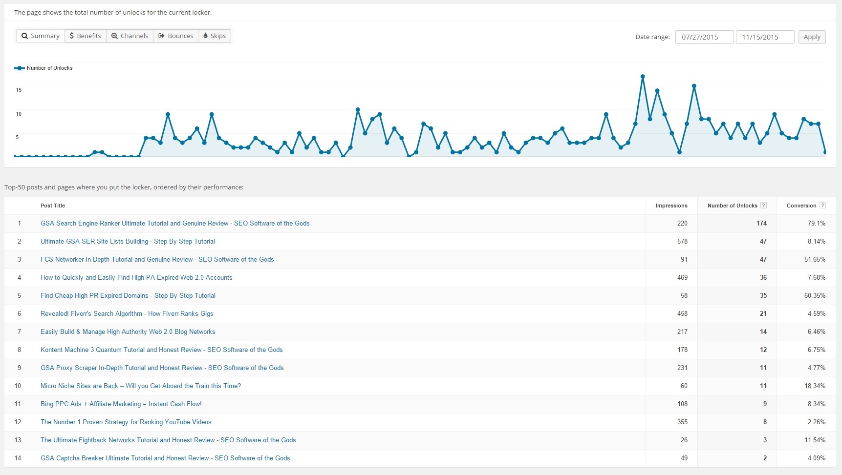
I did not really expect to get a lot of subscribers the first month I launched the site, but I guess I didn’t comprehend the power of content locking back then. Let me show you what I mean:
Just take a look at the conversion rates of some of the email lockers – we have 79.1%, 51.65%, and 60.35%, which are ridiculously high conversion rates. The big spikes in leads you see form the above diagram are from days when I released a new post with an email locker and then started promoting it. Keep in mind that all these leads are just from the email locker and none of the other opt-in forms throughout the site.
Now, a very important thing to consider when using content lockers, especially email lockers, is intrusion. You don’t want to be too intrusive to your readers with too many email lockers, because they will most probably get annoyed and leave. But, if your article is great, I don’t think anyone would mind subscribing just to read an important piece of information – after all, we live in the information era. Other important things I want to note about email lockers:
- Always write a build up before the content locker – that way, your readers will be so excited that they would subscribe in a heartbeat.
- Include content lockers after you have already given more than enough information on the subject – don’t start with a content locker since that is a really bad practice and will most probably cause the reader to leave.
- Make the content locker as simple and straightforward as possible – what I really love about BizPanda is that after a person enters their email and clicks the “Unlock” button, the opt-in changes and gives them directions as to how to proceed with the unlocking process. If there’s something I’ve learned on this good Earth, it’s that (most) people need directions in life and your responsibility is to give the people what they want and need.
- Make sure that the content you lock actually deserves to be unlocked – if you lock 2 sentences of some generic information, there’s a good chance your brand new email subscriber will unsubscribe not long after.
- Customize the opt-in form so that it stands out from the rest of the content – many people don’t have the time, for whatever reason, to read an entire post, so they will scan the content trying to find that specific piece of information they are looking for. So, you need to make sure that your content locker contrasts with your content. For different themes, you’d have to add different CSS code to achieve that and sometimes, you don’t need to do anything.
Now, an important thing to note here is that you will first need to have Social Locker before you can use BizPanda, so just keep that in mind. I didn’t know that, but even if I did, I would have still purchased this plugin – it’s simply awesome and the results we’ve achieved with it prove exactly that.
As of the time of the writing of this post, BizPanda has brought in a total of 484 leads over a period of 111 days which translates to about 4.36 leads per day. But, if we look at the report for the last 30 days, we have a total of 208 leads or roughly 6.93 leads per day. I know that this is not something spectacular, but for a 3 month old baby website, it’s not too bad in my opinion – also considering the fact that it is not a squeeze page nor is it solely focused on capturing emails.
Okay, so far, we’ve looked at the type of opt-ins that lock content i.e. the most effective ones in my opinion and experience. Now, let’s look at all the other opt-ins throughout our website – courtesy of Thrive Leads.
Implementing Thrive Leads
For the first three months, this website had the following opt-in forms implemented:
- Content lockers – great performing opt-in forms courtesy of BizPanda that were bringing in about 99% of the email subscribers.
- Sidebar opt-in – low performing opt-in (getting no more than 5 leads per month) created using the WP Subscribe WordPress plugin in combination with the Q2W3 Fixed Widget plugin.
- Post footer opt-in – an opt-in form right after the end of each article created using the Optin Forms WordPress plugin, which got 1 or 2 leads for those entire 3 months of being active.
- Lightbox opt-in – an opt-in that popped up every time a visitor’s mouse moved towards that infamous “x” button. This one was created using the SumoMe WordPress plugin which I wouldn’t recommend to my worst enemy – they had a damn ribbon inserted at the top right of your website that linked back to their website and you had to pay for it to be removed. The worst part was that this ribbon was not loaded via HTML which could have easily been hidden with CSS, but via a request to their service that returned the code as a JSON object, so in order to remove it, I had to write some custom JavaScript. Basically, what I’m saying is, don’t go with SumoMe.
After about 1 week of slow page times which led me to speed optimize the site, I removed the SumoMe plugin and didn’t implement any Lightbox opt-inf after that for quite a while all the way up to about 1 week ago. But why did I leave the low performing sidebar and post footer opt-in forms for so long? They weren’t bringing almost any email subscribers right?
Yes, that is true, but I was basically waiting for the moment when I would have enough lead magnets to include throughout the opt-in forms of the site. For those unaware, a lead magnet is basically something (e-book, report, tool, content, etc) that you give out for free in exchange for a person’s email address.
So once this website had enough posts, I created these lead magnets which were basically some of the posts converted into PDF files and then all I had to do was implement opt-in forms throughout the site. But, I wasn’t going to use the WordPress plugins I had previously used since they had no analytics, no split testing functionality and pretty much no customization options.
I read several posts which compared multiple lead generation WordPress plugins (both free and paid), and I decided to go with Thrive Leads. Why? Quite simply because I liked the design of their opt-in forms and also because the plugin had all the functionality I needed and much more:
- It could insert opt-in forms in all the high converting locations:
- Ribbon
- Lightbox
- Widget
- Post footer
- Slide in
- In content
- Screen filler Lightbox
- PHP code
- Scroll Mat
- It could be disabled for mobile devices.
- Its default opt-in forms could easily be customized.
- It could split test forms.
- It has an analytics panel which shows you all the reports you need in order to improve your conversion rates and total number of leads.
- It is integrated with all of the top EMS including MailChimp.
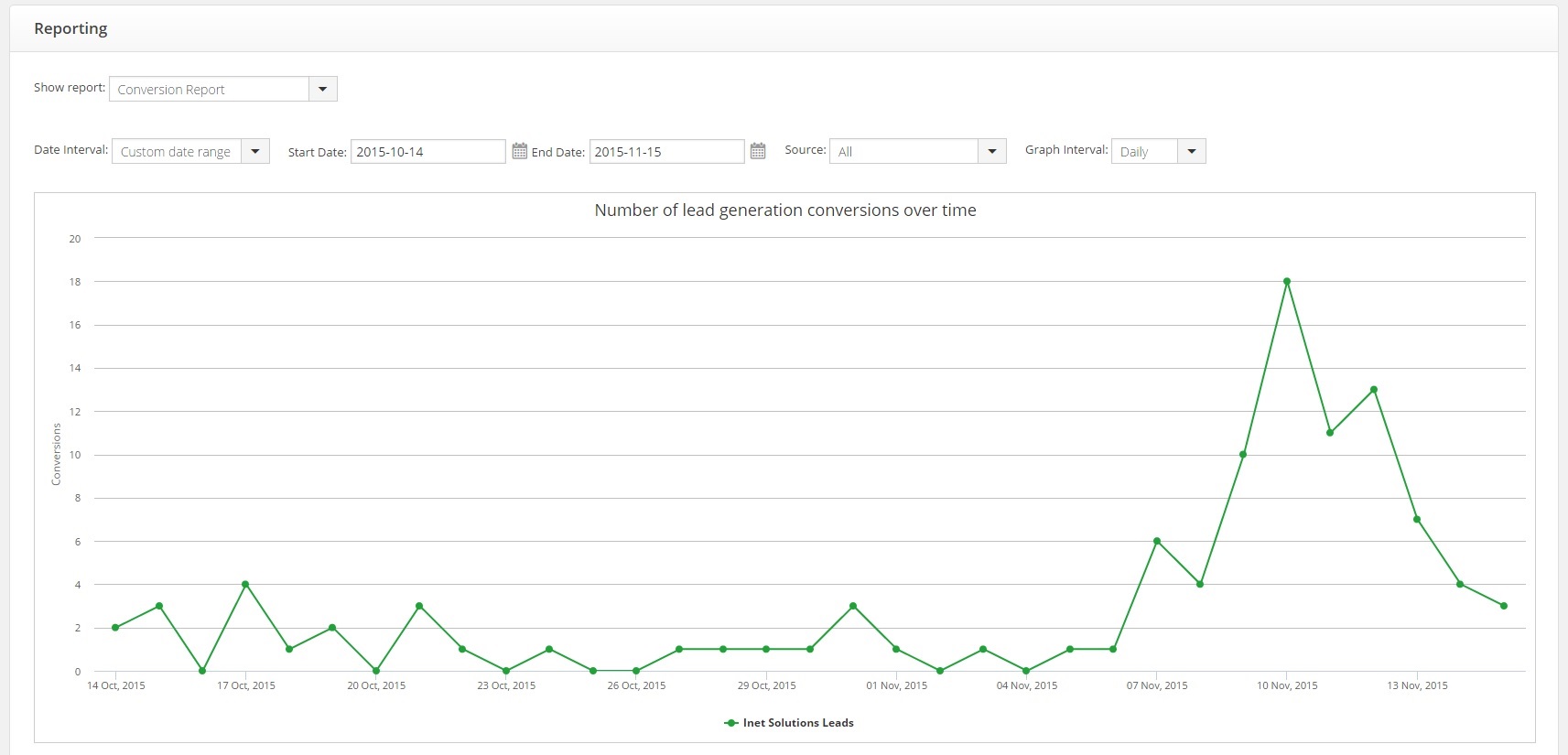
Thrive Leads also comes in with its signature “Content Builder” which is a very easy-to-use front-end visual editor for WordPress. That’s the one you use to create and customize the opt-in forms. Now, like with BizPanda, let me first show you the results we’ve gotten from Thrive Leads since I implemented it into the website on October 14, 2015:
A total of 104 conversions over the period of 31 days or 3.35 conversions per day on average. Now, that huge spike that you see in the conversions is the day that I enabled the “Screen filler Lightbox” and “Post footer” opt-ins of Thrive Leads. Up until that point, only the “Widget” opt-in was active (in the sidebar) and while performing much better than WP Subscribe, it was still getting, well, not satisfying results.
Currently, I have enabled only the aforementioned 3 types of opt-ins with all of them being disabled for mobile phones. Now, since the activation of the “Post footer” opt-in and especially the “Screen filler Lightbox”, over the last 7 days, Thrive Leads has brought in a total of 70 conversions which is exactly 10 per day. Imagine what would happen if I activated all of the opt-in locations…
So, why haven’t I done that? Well, it’s because I don’t want to cross the line of website visitors thinking to themselves “okay that’s great content so a few opt-in forms don’t bother us” – and it’s a very thin line. I mean, it’s more than enough with the huge “Screen filler Lightbox”, which I wouldn’t have enabled at all if it weren’t for a few tests that I did.
To be honest, I do understand the intrusion of such a big opt-in and I also hate it when it pops up on my screen when I visit other sites, which is why I’ve taken extra careful measures when I was creating the opt-in such as showing it only on exit intent, showing it only once every 7 days to the same person, and making it simple and understandable as to why a person would want to get on our mailing list.
I also believe that the content on this website is extremely helpful to many (most) people in the online marketing niche, so I don’t feel like I’m intrusive at all when I ask for a person’s email. On the contrary – I believe that people have the privilege to be on our mailing list and receive the awesome content that we put out directly into their email inbox. But hey, that’s jut me.
Now, let’s look at how you can transform your website into a lead generating machine using the awesome functionality of Thrive Leads.
Transforming Your Website Into a Lead Generating Machine
The first thing you want to do when you install Thrive Leads on your WordPress site is to connect it to an EMS. This happens via the “API Connections” tab from the main menu:
It’s pretty straightforward. You choose your EMS, you enter your credentials and you are good to go. The following services are supported:
- MailChimp
- Aweber
- GetResponse
- MailPoet
- WordPress
- Ontraport
- iContact
- ConvertKit
- ActiveCampaign
- Infusionsoft
- SendReach
- KlickTipp
- Sendy
- ArpReach
- Drip
- Constant Contact
- MadMimi
- HubSpot
- Webinar JamStudio
- GoToWebinar
- reCAPTCHA
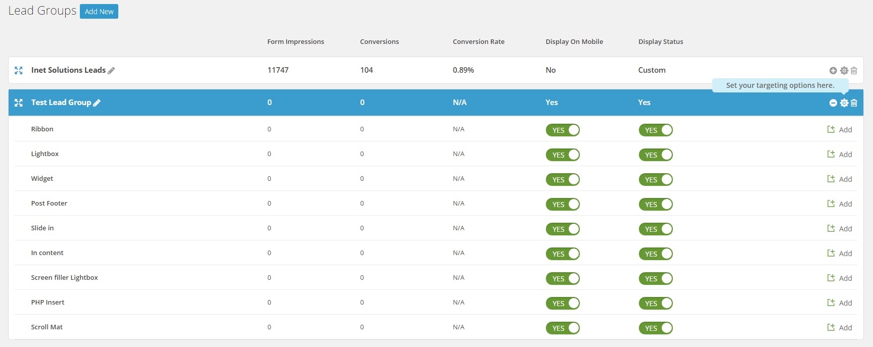
When you are done with that, you need to go to the main Thrive Leads “Dashboard” tab. Here’s a preview of mine:
Of course, you will see a bunch of zeros and no lead groups at all. So, the first thing you have to do is create a new lead group. Now, the way you split your opt-in forms via lead groups is very important. For example, if you want one opt-in shown in the sidebar for certain posts only, and then another one shown for other posts, you need to create 2 lead groups.
As you can see, I have only one leads group, because currently, I don’t split the opt-in forms as per the example above. I did that at first, but the data showed that the strategy wasn’t as effective as it is now. That of course is not to say that it will be the same for every opt-in and every website. For more information about lead groups, check out this post.
Now, once you’ve created your lead group and you expand it, you will see something like the following:
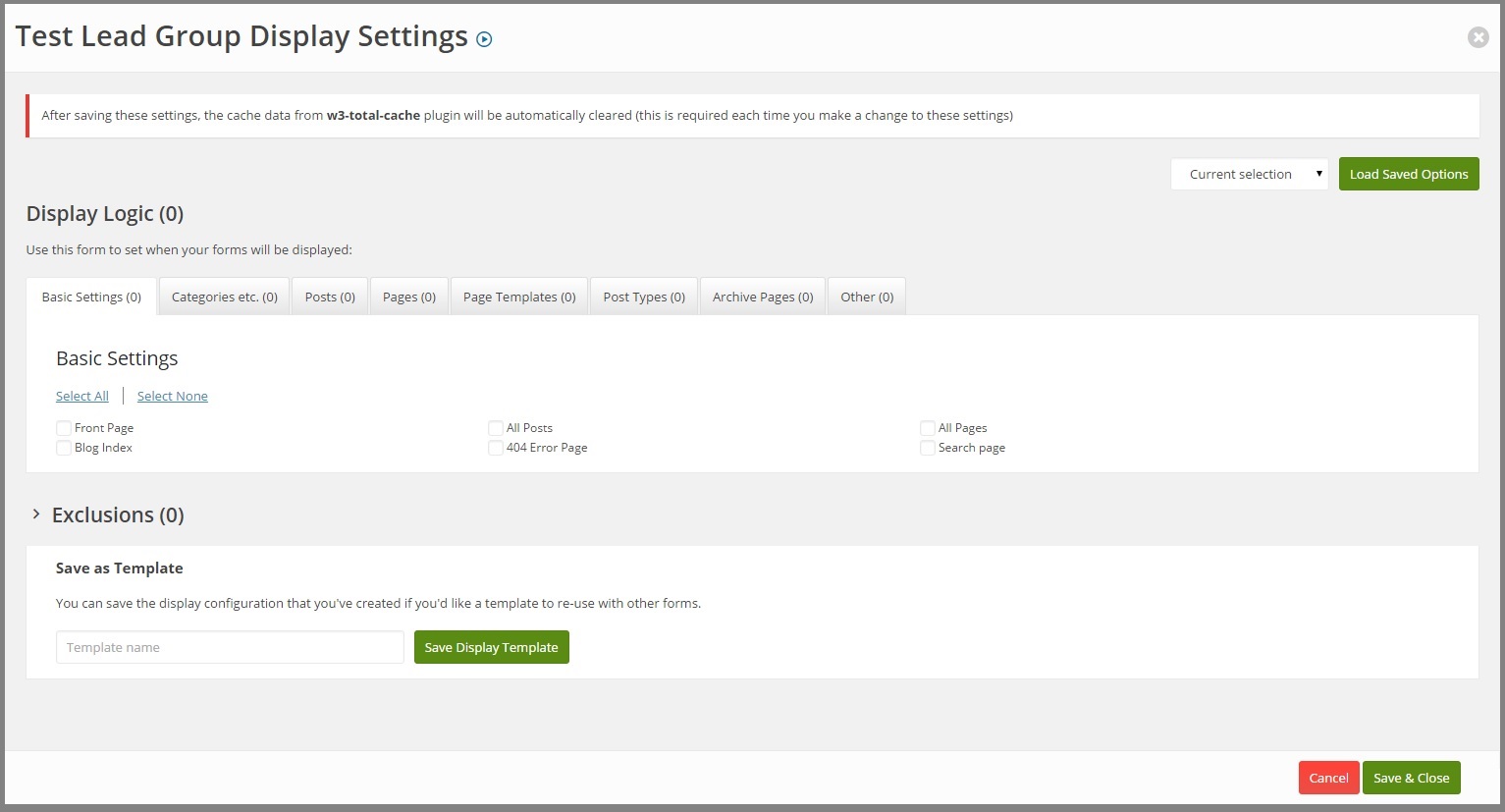
All of the opt-ins are enabled by default. Of course, nothing will show up because there are no forms created for each of the locations. But before you get to the creation of your opt-ins, you need to set the “Display Settings” of the lead group i.e. the pages, posts, and other URLs it is supposed to show its forms. So click on the icon that is pointed at by the “Set your targeting options here” message:
So basically, you need to tick the places where you want this lead group to show its opt-in forms. So for example, if you select “All Posts”, that means that all the forms that you have selected for this lead group i.e. sidebar, post footer, etc, will show up on every single post you have on your WordPress site.
A very important thing I want to note here is the fact that if you add another lead group and you select “All Posts” again, and then you select opt-in form locations that are already selected in the first lead group, the latter lead group’s forms will not show up. So, you don’t have to worry about two opt-ins popping up in the sidebar or something like that.
When you are done selecting the locations where you want this lead group to show its forms, you need to move on to the creation of these forms. Now, as I already share with you, only the “Widget”, “Post footer”, and “Screen filler Lightbox” locations have been activated for our lead group. However, in the future, I have plans on activating the “In content”, “Ribbon”, and “Scroll Mat” opt-in locations, but in order to get there, the website would have to, respectively, have at least around 50 posts, gather some more traffic, and have something very special to promote to our visitors.
Now, it is all up to you to choose the locations where you’d like your opt-in forms to appear, but generally, you’d want to start slow with one form after another in order to track their performance and tweak them as you go. Here’s some data gathered by the three active forms we have on this website:
- Widget (active only in the sidebar) – 7,069 impressions, 40 conversions, 0.57% CR, running for 31 days.
- Post footer – 2,753 impressions, 17 conversions, 0.62% CR, running for 7 days.
- Screen filler Lightbox – 1,948 impressions, 47 conversions, 2.41% CR, running for 7 days.
As I add more and more opt-in locations and forms, I will keep on updating this post with the latest data. Now, once you have left only the opt-in locations where you want your forms to appear, you need to create a form for each of them and here’s how. You simply click on the “Add” button against each of the locations, then you click the “Create Form” button and finally, you name your form:
Next, you click the first button (in blue) to the right which will fire up the “Content Builder” that we talked about earlier and you will be able to choose your starting opt-in template and then customize it to your taste. For full video tutorials on all aspects of Thrive Themes’ “Content Builder”, go here.
And that’s basically it. Once you are done with your form, you simply save it and it will start showing up on posts, pages, etc, that you have selected from the “Display Settings” a little bit earlier. Now, a great marketer always split tests everything that they can, and that doesn’t exclude opt-in forms.
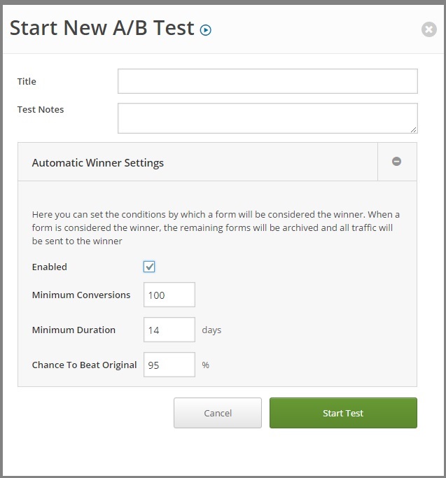
Thrive Leads has made it extremely simple to split test forms – all you have to do is go back to the above screen where it shows all your forms for a certain location, then create a new form either using the “Add New Form” button or the “Clone” button (the purple one), and finally, clicking the “Start A/B Test” button:
After that, it’s all self-explanatory – you name the test, you add some notes, and then you decide whether or not you want Thrive Leads to automatically leave only the winner of the split test enabled – that’s it. When you have a winner, you add another challenger form and you keep on doing this until you are satisfied with the conversion rates of the form. Obviously, I am currently not satisfied with ours, so I am split testing them as we speak.
I only recently implemented Thrive Leads, so I have a long way to go before I have reached the best opt-in forms performances for this website. Split testing is a long lasting (never ending) process, but it is more than well worth it.
And that’s basically all you have to do to turn your website into a lead generating machine. Now let’s recap again, step by step:
- Installing Thrive Leads.
- Connecting it to your EMS.
- Creating a new lead group.
- Configuring its “Display Settings”.
- Configuring the enabled and disabled opt-in locations for the lead group.
- Creating a form for each opt-in location that you have left enabled.
- Split testing each form.
- Enjoying the exponential growth of your mailing list.
And that’s basically all that we currently use in terms of lead generation. Those two plugins have grown our mailing list to where it currently is and with the recent implementation of Thrive Leads, the website is getting more and more email subscribers every day. Now let me show you how you can manage those hard earned emails that you have in your mailing list – and how we manage them as well.
Managing Your Mailing List
You’ve already turned your website into a lead generating machine and now you need to prepare for the many email subscribers coming your way. How? Well, you already have a MailChimp or other EMS account with a list created on it since you connected it to Thrive Leads and BizPanda. So anytime you get a conversion, that email will be stored on your EMS of choice.
Now, I want to outline what this section will include as there is a lot to talk about in terms of managing your mailing list:
Splitting or combining your email subscribers – should you have one mailing list or severa?- Branding your email marketing – messages should be easily recognized as your brand’s plus relationship building.
- HTML emails vs plain text messages – which one performs better?
- Setting up your autoresponder series – the sequence of emails that will build a relationship between your brand and your email subscribers while at the same time keeping them engaged with your website.
- Email copy – what words will you write in your message in order to get optimal opens and clicks?
- Keeping your list clean – you don’t want to send out emails to people who won’t even open them.
Alright, you know what you will learn in this section, now let’s get to it because we have a lot to cover.
One Mailing List or Several?
That is the question. Basically, what you need to consider before you launch your lead generation machine is whether or not you want to split your email subscribers. Why would you want to split them you ask? Basically, the answer to the above question is to keep them more engaged with your website and also to lower the unsubscribe rates. Let me illustrate this with an example.
Let’s say that you have set up a sidebar opt-in on your website that gives out a free blueprint to making money on Fiverr in exchange for the person’s email address. When they subscribe, you have two options – either add them to a list with all of your subscribers or add them to a specific list that contains only people interested in Fiverr related information.
That way, you can send the Fiverr specific mailing list only content relevant to their interest instead of sending them, for example, a tutorial on building site lists for GSA SER. Keep in mind that splitting your lists will mean that you will have to set up a separate autoresponder series for each one and that you will probably need to have a lot of content to begin with.
When I was creating the list for this website, I was on the same crossroads. But I thought about it for a minute and I decided to go with the one mailing list scenario (for now). Why? Quite simply because my niche allows it. Let me explain.
You see, everyone in the online marketing niche, whether it is the sub-niche of making money on Fiverr, or the sub-niche of ranking YouTube videos, wants to, well, make money online. Yes, some subscribers will be more interested in one thing than the other, but generally, they’d want to read it all.
I speak from my own personal experience because when I was starting out in this business – I read blogs and forums and I read them all and it didn’t matter what the blog post was about as long as it was in that more abstract niche of online marketing.
The other thing that made me go with the single list approach was the fact that, at the launch of this website, I didn’t have too many posts to begin with. So, if I had split the main list into several small ones, some of them wouldn’t even receive any emails after the first week or two, because there would be no relevant articles.
That’s a very bad thing to do, because once someone gets on your mailing list, you want them to hear from you as often as possible, otherwise, your brand will die in their minds and someday, when you finally have some content for them and you send them that email, they will be wondering who is this “Inet Solutions” guy that’s bothering us after all this time.
However, I have an idea inserted in my mind that once I have more than enough posts on the website, I will segment the mailing list into smaller lists and target each of them more specifically. But for now, the one list to rule them all strategy is doing great.
Of course, every niche is different and every website is different. So, deciding whether to go with one list or several is a contextual process. You need to understand your target audience and you need to know what your website’s content will be about. Only then can you make the right decision.
Branding Your Email Marketing
Once you create your list, you need to brand everything about it. And that starts with the default sign-up forms provided by MailChimp. So, what you need to do now is go to your list and then click on the “Signup forms” menu. Once there, you need to select the “General forms” and you will be taken to a page where you can modify you default forms.
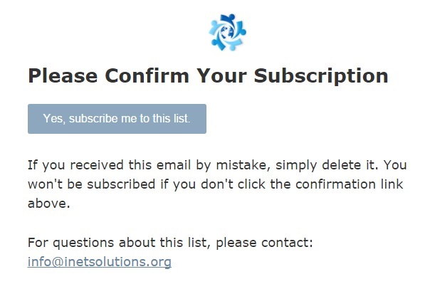
Keep in mind that whatever form you change, the others will be changed accordingly as well. So if you add your website’s logo at the top of the “Opt-in confirmation email” form, it will be added to each and every sign-up form. For instance, that is what our opt-in confirmation email currently looks like:
Beats the hell out of the default template and is also in tone with our brand theme i.e. blue button, blue link, and the logo at the top. This step is really important and will not only lay the foundation of your brand’s relationship with your subscribers, but will also improve on opt-in rates. Of course, you are now probably thinking why would you want someone to confirm their email address? Can’t you just add them straight to your mailing list?
You can, but you don’t want to, because you’ll end up with a huge list that is full of spam emails and you won’t get anything out of it – not to mention that you will start paying a lot more a lot sooner because of the huge spike of email subscribers you will get. So always use double opt-in – it’s better to have a list of 100 dedicated subscribers than a list of 10,000 non-engaging followers.
Next, a very important thing you want to do is to select the “Final “welcome” email” and deselect the “Send a final welcome email” checkbox. You will set up a welcome email from the autoresponder series we will create in just a minute.
Then, you want to go to the “Confirmation “thank you” page” form and you want to paste in the “Instead of showing this thank you page, send subscribers to another URL” input an URL to a page where you will keep all the lead magnets we talked about earlier. So, when a person confirms their subscription to your mailing list (clicks the “Yes, subscribe me to this list” button from the screenshot above), they will be taken to a page where they can download the resource they subscribed for.
Now, once you have branded your sign-up forms, you need to make sure that you have branded all of the settings of your mailing list. So first, go to “Settings” -> “List name and defaults”, and fill in everything there – you should have already filled these at the time of list creation, but you never know.
Next, go to “Settings” -> “Required email footer content” and edit everything there. The content here is the information shown in the footer of each email you send to your mailing list i.e. mailing address, links to unsubscribe and update preferences, copyright, etc.
And that puts an end to the branding of your email marketing. This is an extremely important part of the process, so don’t be afraid to invest as much time as possible on perfecting it.
HTML Emails vs Plain Text Messages
I’m sure that you’ve noticed how some of the emails you receive are the well-known plain text messages and some have images and style inside them. The latter are comprised of HTML code and are much more stylish. However, there is one problem with them – they do not perform as well as plain text messages in terms of open rates (the number of recipients who open the email) and click rates (the number of recipients who click on something in the email). Let me show you why that is.
A recent case study conducted by HubSpot shows you that “nothing boosts opens and clicks as well as an old school, plain-text email”. I will spare you reading the whole thing (which I recommend you do), by summarizing the most important points proven by the data of the research:
- HTML emails and plain text messages will have the same deliverability rates provided that the HTML email has no mistakes in its code and it also comes with a plain text version.
- Around 64% of people said they preferred HTML and media-rich emails over plain text in a 2014 survey.
- An email containing simple HTML (a few GIF images), was opened 37% less times than the plain text message.
- An HTML email containing more complex code was opened 25% less times than the plain text message.
- An HTML email containing extremely styled content with images and social media buttons, was opened 23% less times than a more simple HTML email.
- The study concluded that simpler HTML emails performed better in terms of open rates than HTML enriched emails, however, plain text messages topped both of them.
- Email services filter messages, especially the ones that contain images and media-rich content, in order to improve the experience of their users. This means that HTML-rich emails have a higher chance of never even reaching their recipients.
- HTML emails also reduced click rates – data from half a billion marketing emails sent from HubSpot customers confirms that.
- The more images in an HTML email, the more the click rates we reduced.
- In EM, as it turns out, less is more.
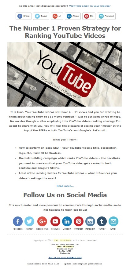
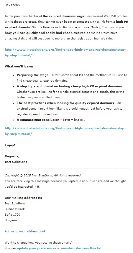
As a person who loves design and aesthetics, I had to do something that I really didn’t want to – I had to edit every single email from our autoresponder series and make it a simpler HTML version without any images whatsoever. Even though the artist in me was screaming “No”, the efficiency that is a fundamental part of every human being prevailed, so I transformed our template from this:
Into this:
And even though I changed it just about a week or two ago, it is already showing results. The emails sent out by our autoresponder series are getting higher open rates and click rates compared to the previous template and they will keep on climbing until the stats of the previous template can be balanced. Even now, our emails are performing great considering the industry average rates for our niche – 12.1% for open rates and 1.2% for click rates while we have 30.9% for open rates and 11.8% for click rates with 99.5% successful deliveries:
As you can see, the rates were going down, but when I changed the media-rich HTML emails into more simple HTML emails, the rates have started to climb back up again. Why didn’t I make them into plain text messages? Well, it’s because MailChimp doesn’t allow plain text messages for your autoresponder series. You can send out plain text messages as an individual campaign, but not as a part of an autoresponder series.
However, the HTML emails still have a plain-text version. Now, even though MC doesn’t have plain text messages for its autoresponder series (which sucks), I still decided to stay with them and not move to Aweber who do allow plain text emails for their autoresponders. The reason being – I think that sooner or later, email marketing will shift to HTML emails “compatibility”, so to speak.
Bottom line of this section – use plain text messages wherever you can and avoid using images in your HTML emails unless you absolutely have to. If you, like me, would still like to add a bit of more style to your emails at the cost of some open and click rates drop, go for it.
Setting Up Your Autoresponder Email Series
As soon as someone subscribes to your mailing list, you want to engage them into your world with a welcome email. Now, the welcome email is extremely important and we will talk about this in a second, but you don’t want to stop there – no, no. You want to continue sending emails to your brand new email subscriber till the end of time. That’s right – forever.
Now, forever is a long time and it would be too much work to manually write and send out emails to your mailing list member after a certain period of time has passed – you don’t want to spam them with too much messages right from the get-go, or ever for that matter, depending on your situation.
And that is where MailChimp‘s automation workflows come in. They allow you to set up a sequence of emails to be sent out to each new subscriber that joins your mailing list. So, once on your list, a person will hear from you on a regular basis (you define the time span between each email) for as long as there are emails left unsent in the autoresponder series. Why exactly do you need these constant emails to be sent to your mailing list?
Firstly, because you will keep your followers engaged with your website and brand (more importantly), secondly, because you will be making money on autopilot, provided the emails you send to your list include something that profits you, and thirdly, most visitors on a website check out 1 or 2 posts/pages at a time – and you want them to see it all. Now, let me show you how you can set up these mutually beneficial autoresponder email series in MailChimp – keep in mind that you need a paid version of the software in order to set up automation workflows.
Choosing The Type Of Your Autoresponders
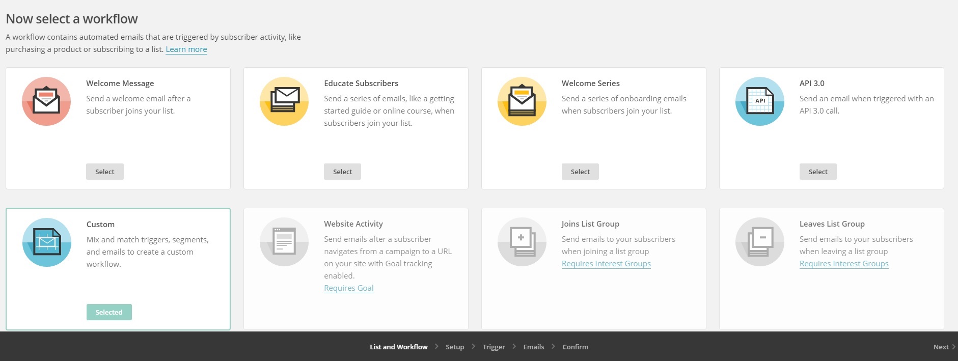
The first thing you want to do is go to the “Automation” tab and click the “Create Automation Workflow” button. Then, you will be prompted to select the list to which you want automation workflow (autoresponders) to be applied. After that, you need to select the type of your autoresponder. Since you will be creating a series of emails to be sent right after a subscriber joins your list, you need to select the “Welcome Series” type:
For more information on the rest of the types of automation workflows of MailChimp, check out this article.
Configuring The Workflow
Once you select the “Welcome Series” type, you will be taken to a page where you can configure the general settings of your brand new autoresponder series. This includes a name, a from name, the from email address, whether or not you want MailChimp to track opens and clicks, etc.
I strongly recommend enabling both the tracking of opens and clicks since this will give you a great insight as to how well your emails perform. Once you are done with that, you need to click the “Next” button at the bottom right of the screen and move on to setting up the “Trigger” for this autoresponder series.
Configuring The Trigger Of Your Automation Workflow
The trigger is basically the event that must occur in order for a subscriber to be added to this workflow. In our case, by default, the trigger is someone subscribing to your list. So, you don’t have to edit anything here – only the option about whether or not you want subscribers that are imported to be added to the workflow automatically.
Creating The Emails
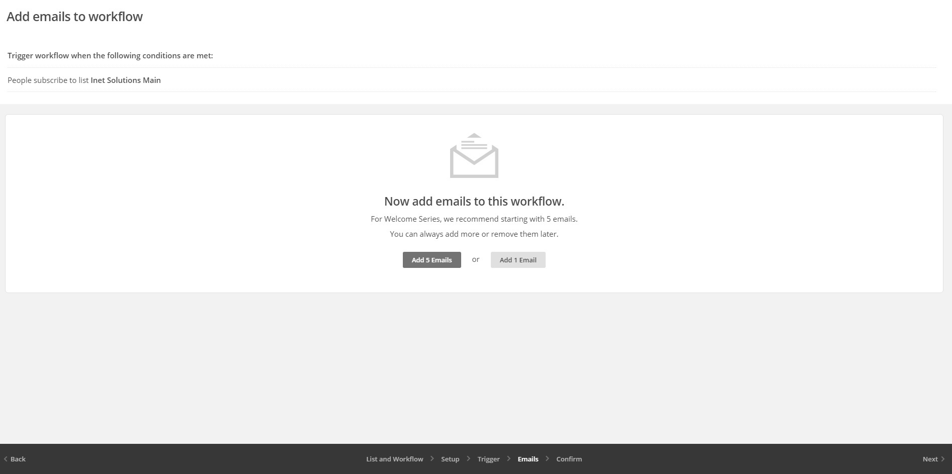
The next step from the creation of your autoresponder series is, well, the creation of the emails sequence:
If you have more than one email that you will include in your autoresponder series, then go with the “Add 5 Emails” button, otherwise, just create the welcome email for now by clicking the “Add 1 Email” button. If you are losing track, basically, each email will represent a promotion of some old “lost-in-the-records” article on your website.
Of course, the emails that you will be adding here will depend on the essence of your website i.e. if it is a blog, if it is a squeeze page, etc. For example, if it is a simple squeeze page, your autoresponder series will most probably include the direct promotion of some products that you are affiliating for. But, in our example, we will be promoting older high-performing posts.
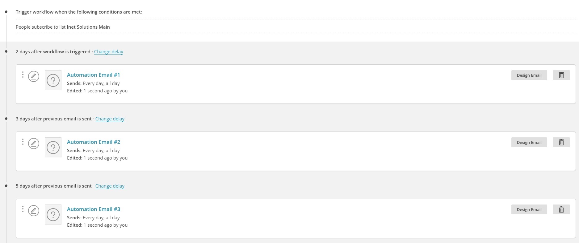
It is a good practice that you have at least 10 blog posts before you launch your website, so that you can add some (all) of them to the automation workflow. Now let me show you what happens when you click the “Add 5 Emails” button:
Basically, 5 new emails are added to the autoresponder series. As you can see, they are still blank and you have to configure each and every one of them. But before you get to that, you must configure the amount of time that has to pass in between each of the emails in the series. For example, as you can see from the above screenshot, currently once a person subscribes to your mailing list, they will not hear from you for 2 whole days.
That’s not our goal since we want to send a welcome (hooking) message immediately after someone subscribes. So, you can simply click on the “Change delay” link and you can set the timer to “immediately”. Then, you need to change the delay before each of the remaining emails in the sequence, however, you need to specify other time spans. For example, we have configured our main autoresponder series to send out 1 email every 7 days.
I have set this number on purpose, because, on average, we release one article per week. Once released, the article is added to the end of our autoresponder series, virtually rendering them infinite. So, when someone subscribes to our mailing list, they will get 1 email from Inet Solutions every week until the end of time or until they unsubscribe.
Of course, some (many) people might consider 1 email per 7 days is just too little, but I don’t feel like we are in a position where we can send more than that – yet. The time span between emails will also depend on the type of your website, so before you set this up, you need to read more about email sending frequency – check out this case study and this article – they will get you on the right track.
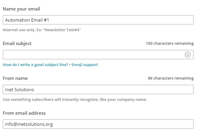
Once you have determined the time span between your emails, it’s time to design them. So, just click the “Design Email” button against the “Automation Email #1” and then prepare to use your imagination, copywriting, and conversion skills:
The first page you are taken to is the main “Setup” of the email. Basically, the first input is the name (label) of the email and the second one is the subject of the email. Now, this is where it gets tricky. If your subject lines are not outstanding you will never ever enjoy those high open and click rates. We will talk about email copy in a minute, so, for now, just fill in the title of the post as the subject of the email and click “Next”.
The next step is choosing the template for this email i.e. its layout. Now, if you didn’t skip the HTML emails vs plain text messages portion of this article, you know that you want to create the simplest possible design – without any images.
The template that we currently use is located at the bottom of the “Select a template” screen and is titled “Simple Text”. So scroll down and select that template. Next you will be taken to MailChimp‘s design editor which is extremely easy to use and even more so since you won’t be using anything special other than simple text.
You already saw how I have updated our emails and what their structure looks like. Basically, if you will be promoting your blog posts, you need to make sure your email contains the following in its body:
- A greeting – this part is very important and depending on the image of your brand, you’d want to play with it.
- One or two sentences quickly introducing the reader to the essence of the article you are promoting.
- Four or five radio buttons that summarize what and how the reader will benefit from this post.
- Link to the post.
- Sign-off words – check this post for ideas.
And that’s it. It doesn’t get any simpler than this. Now, you will also notice that we have included the link to the post twice – before the “what you’ll learn” section and after the radio buttons. This makes it easier for the reader of the email to notice the link on devices with smaller resolutions, which leads to higher click rates.
As for the welcome email, you basically need to build up your subscribers i.e. create some drama or simply specify what they can expect from you in the near future – you know, email-wise. There are a million different variations of welcome messages and the one you come up with will strongly depend on your niche, target audience, brand image, goal of your automation workflow, etc – there is no one right formula for this.
The last thing you have to do for each email is to configure when you want it to be sent out:
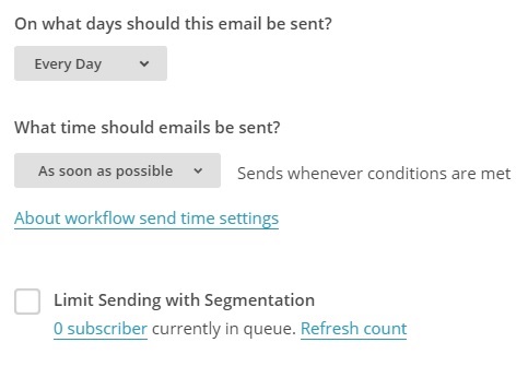
Leave the first option as it is since you have set up a specific time span between the emails and you don’t want to disturb that. However, you want to change the “What time should emails be sent” option. We send all of our emails between 10:00 A.M. and 11:00 A.M. ET. If you are not sure when you want to send your emails, check out this case study.
And that’s basically it. The last option from the image above allows you to send this email only to a portion of your subscribers who are in the queue to receive this message. Once you make sure everything is as it should be, you can click“Save and Continue” and move on to designing the next email.
Now, when I first created our automation workflow, it was already pretty solid thanks to all the research on EM I had performed beforehand, excluding the fact that all the emails had way too much HTML in them. But, over time, I have tweaked them and perfected them as much as possible and will continue to do so indefinitely.
If you want to see exclusive behind-the-scenes footage of all of the emails in our main automation workflow including subject lines, message body, design, and full detailed analytics for each email (open rates, click rates, monthly performance graphics, abuse reports, etc), download the archive below:
And that’s about it for the set up of your automation workflow. Once you are done with the initial state of your autoresponders, it’s time to let them to their thing. So click the “Exit” button on the final “Confirm” page of your automation workflow, and it will be ready to send emails to new email subscribers.
As it does that, you need to make sure to regularly perform analytics checks for all the emails in the series. For each email, look for:
- Low open rates – indicator of a weak subject line or too much HTML-rich content in the email.
- Low click rates – indicator of low levels of interest in the post or simply a weak copy in the message body.
- Abuse reports – are you spamming your email subscribers?
- Monthly performance – is the email’s performance and efficiency improving with each month?
- Number of people who have unsubscribed from a particular email – are too many people leaving your mailing list because of this email?
- Number of messages that have bounced – gives you an idea of how many fake email subscribers are cleaned.
The above statistics will give you an exact estimate of how an email is performing and will point you towards the actions you need to take in order to improve its performance. As long as you have autoresponder email series, you will have to perform these analytics checks – if of course, you want to improve the results you get from your mailing list – it’s your choice.
Our emails from above + the analytics inside should have given you an idea of what works and what doesn’t (generally) in our industry. Of course, there’s always room for improvement in the email marketing world – and it usually stems from the bettering of the copy of your emails.
Email Marketing + Strong Copywriting = Results
If you ever want to achieve anything from your email marketing, the words you use in every message you send to your subscribers must be outstanding and on point. Now, just like everything else in EM, the copy of your email will vary from niche to niche, from brand to brand, from topic to topic, from purpose to purpose, etc.
However, there are some general best practices that you’d want to keep in mind when writing the content for each of your emails. Since I already shared what we use for the email body in the previous section, I will no do the same for the subject line:
- Be provocative, compelling and/or contradictive.
- Shock the reader.
- Don’t use too many words – less is more as we already established that about EM.
- Prepend some topic relevant symbol to the subject line – MailChimp allows you to choose from a bunch of images that you can insert anywhere in the subject line.
- Contrast text wherever possible with special characters and numbers – for example, if you have the phrase “Marketing and Advertising” in your subject line, replace the “and” with “&”. Other special characters you can use are brackets, braces, etc. For instance, if you are sending out an email that includes the promotion of some case study, you can include the following in the subject line – “[Case Study]”. As for the numbers, just read this piece of art and you will start using numbers (almost) everywhere in your copy.
- Limit the time window – including a sense of urgency will quite naturally force people to check out the email.
- Question your subscribers – questions are one of the most engaging force in the universe, so take advantage of them.
- Create a sense of curiosity – whether by ending the subject line with dots, or by using the “your’re missing out on…” angle, once curiosity arises in human beings, it’s hard to not give in to it.
The above tips, while great, should only be used to direct you on the right path towards high open and click rates. It is all up to you to find the right combination of these components that works best for your specific mailing list, industry, and brand. A few articles on the subject of email copywriting that I’d recommend you read are this one, that one, and this last one.
Keeping Your Mailing List Clean as a Whistle
You don’t want to send emails to people who are not at all engaged with your content right? I thought so. Now the great thing about MailChimp is that it has a subscribers rating system, which assigns 1 – 5 stars to each of your followers depending on their activity:
- 1 star – the subscriber is not engaging with your emails at all.
- 2 stars – the subscriber is most likely a new member who has yet to engage with your messages or a previously more active member that has gone cold.
- 3 stars – the subscriber interacts with your emails but is not that consistent in their engagements or simply hasn’t been on your mailing list for long enough to get a higher rating.
- 4 stars – the subscriber is relatively active and often opens and clicks the emails you send.
- 5 stars – the subscriber opens and clicks almost all of your emails.
It’s pretty obvious that we do not want to have any 1 star followers, so let’s remove them. Login to your MailChimp account and go to “Lists”. Click on the name of the list you want to clean up and then click on the “Segments” button. From the drop down, click on “New Segment” and then select the following filters:
Then click the “Preview Segment” button below. Next select all emails from the table that appears, click on the “Actions” button and then click “Unsubscribe”. Confirm when asked if you are sure and be done with it. Congratulations, now your list is a little bit cleaner.
And with that, we put an end to the management of your mailing list section. But if you think it’s all over, you’re seriously wrong…
Summary
Email marketing is a never ending pursue of performance improvement, which is why it is so damn interesting. You need to constantly tweak your email content, design, segmentation, sequence, time span, etc – pretty much everything that can be tweaked should be tweaked. Stopping this process of constant improvement will result in a drop of the effectiveness of your emails and you just can’t have that.
Bottom line is if you do not save up on time that should be invested in email marketing, you will get to know the feeling of having a semi-automatic money making machine. I have shown you our exact EM strategy and all of the online marketing tools included in it, but it is up to you to decide how you want to go about it and what will work best for you.


